Newbie issues following M8 tutorial
Posted: Tue Jan 27, 2015 8:12 pm
I am trying to see whether StarTools is a good match for me, looking for something quick and easy for processing on a Mac. I am very new to astrophotography (ok, some film photos in the 90's are not near the same experience) and I don't have clear skies (in any way, both UK climate and in a city), so I can't really get the best of my Canon 550D on a Skywatcher 80ED - so post-processing should help as much as possible. I am trying out a stacked M42 photo which I try to process with various methods to see which I like to use best. StarTools seems promising (some modules seem to do a great job), but I get a bit inconsistent results trying to get a good workflow and repeat it. So I thought perhaps I should log it here and see if there are some obvious mistakes I am doing.
For reference, the stacked FITS image is here: https://www.dropbox.com/s/6omxtx27sqbbe ... d.zip?dl=0
So, for this run that I will log, I first bin the image at 50%. Not sure if it is the recommended thing, but mainly I want to avoid memory usage go out of hand (I already reported what looks to the developer like a memory leak on 1.4/Mac). I also crop afterwards 99px off the left, 100 off top and 20 off right and down to frame it nicer.
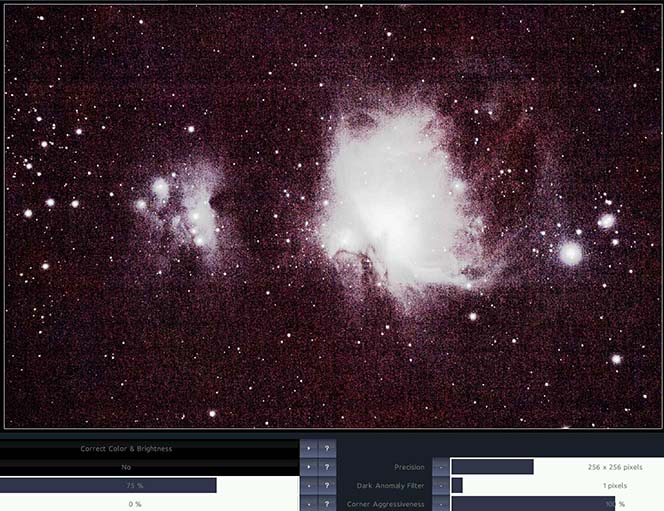
Then I use autoDev for the first time. Ok, I disregard the fact that it brings up all the noise etc, we use it to see what's wrong with our image:
Moving to the Wipe module. I see that there is a bit of vignetting at the edges, less that it would have been if I had not cropped, and also it seems to me there is a gradient as the sky goes a bit darker going upwards. I try using the vignette preset or the gradient preset, I even try after masking out the two nebular regions, but I don't see it being that effective (or in general doing much), e.g. the top left clearly has much less bright noise than the other parts. I don't know if I can do something more or the situation is just too hard for the wipe module? Anyway I keep this result:
Which after an autodev with a ROI set does look like something:
Then going on deconvolution. I try the automask and it fails miserably.
For the developers: since it tells me at the end that my mask does not look like a star mask, i.e. it knows it failed, shouldn't it have automatically given a try with different presets?
But using the auto/mask settings I did manually find something that works:
In retrospect, comparing to the tutorial video, I perhaps should have "grown" the mask to include the area around the center of each star. Right?
In any case, deconvolution seemed to help a bit although unlike the example I had to leave Radius to 1.5px (probably because of more worse data). I kept it and went on to HDR, where the default was obviously not for my image:
I quickly figured out that a larger detail size was needed, over 200 px. So for something more modest:
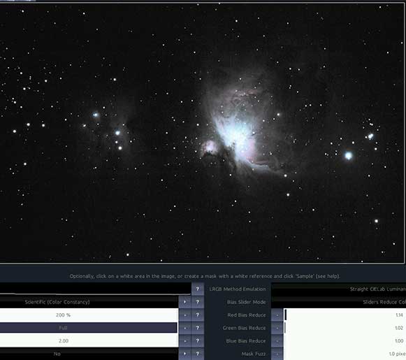
Wavelet sharpening with the default settings also gave a good result, sharpening some details. So we are going in the color module with this:
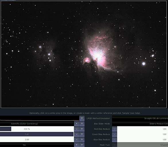
But it seems that apart from increasing saturation, removing the color biases gave a more desirable color balance.
And finally I turn tracking off and apply this noise reduction:
This is the final image in its "full" glory:
To get an idea, here is one run I did under Windows (on my laptop, so I'd prefer to switch to my Mac desktop) with various software (I think for this run I mainly used the free PixInsight LE):
The comparison tells me that I got some good noise reduction out of StarTools and also nice detail on outer clouds, however there are some areas where it is worse. Hence the question is what I could have done better? The main issues I see are:
-The core is a bit too bright hiding some detail. E.g. trapezium is more visible in the alternative processing. Was this a problem with autodev? Select a smaller area when declaring ROI? Or skip autodev and try the develop module?
-The colors are more washed out in StarTools. This might be due to more brightness overall, but I prefer the more reddish rather than pinkish hues.
-The stars seem a bit more unnatural. Perhaps my star mask was not that good while using Decon?
-There is no color in the running man nebula to the left of M42. I tried bumping Saturation to no avail. There is a bluish hue in the alternative processing image, so where did I lose that information?
Also one more suggestion to developers. Like we have before/after switching to see results of settings, could there be a switch between the last tried setting and the current? E.g. switching the display between the previously tried 10% setting and the current 20% setting, instead of just having "before" which really is "before applying this module".
Thanks in advance for any feedback, StarTools seems quite promising but I don't feel like "I'm there yet" using it.


